import pandas as pd
photos_df = pd.read_json('june1777.json')FLICKR ANALYSIS USING PANDAS

’^#+ by june
(at least that’s what I think it’s called if not a typo)
Intro
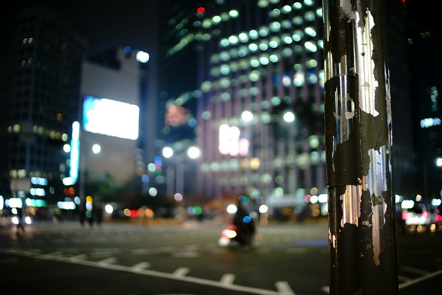
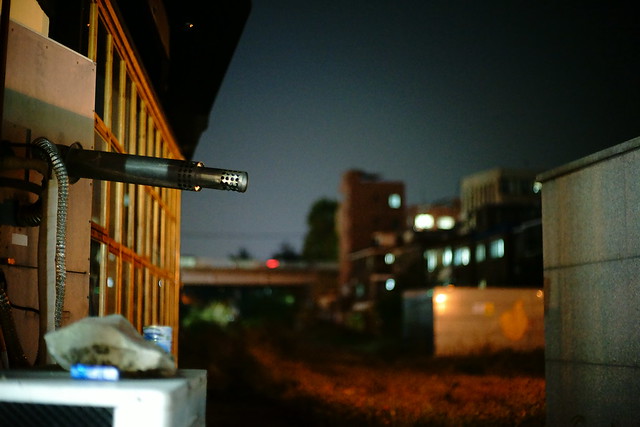
I’ve been a fan of june1777’s flickr photos for almost a decade now. He has an uncanny ability to spot and capture scenes where there is roughly equal distribution between light and dark, a yin-yang of sorts, and doing so in a way that is often striking and beautiful .. but not intentional. He’s a fan of fast prime lenses shot wide open, often wandering the streets of South Korea after dusk, letting the juxtaposition of the glow from the evening sea of lights settle in against the urban landscape.
I find myself inspecting not only his images but what I could glean from his choice of gear and settings used. I thought it would be a good exercise to attempt to grab whatever exif data I could via the flickr API and analyze june1777’s photo data en masse. Below are the results.
Note: Unfortunately I lost the part of the code where I did the actual grabbing of the data. The short of it though is I used Alexis Mignon’s most excellent flickr-api python module to grab whatever exif data was available for each of june1777’s photos. I saved the data for each photo as a dict, which was then appended to a list of photos. I exported the whole thing as a json file and that’s where I pick up from below.
Import pandas and flickr data
Let’s see what kind of Camera models are in use
photos_df.Model.value_counts(normalize=True)SP-3000 0.428256
Canon EOS 5D 0.330533
ILCE-7 0.121601
ILCE-7M2 0.047535
NEX-3 0.026531
QSS 0.023657
CONTAX N DIGITAL 0.016140
210 0.001990
QSS-29_31 0.001105
201 0.000884
260 0.000442
Canon EOS 5D, nds3 0.000221
225 0.000221
236 0.000221
252 0.000221
278 0.000221
256 0.000221
Name: Model, dtype: float6433% with a Canon EOS 5D
12% with a Sony A7 MK1
4% with a Sony A7 MK2
He also dabbled with a Nex-3 for a bit
Also worth noting a little more than 40% of his photos were film scans.
Let’s prune non-digital photos
Drop the Fuji film Scanner (SP-3000) and the ‘QSS’ scanner which won’t contain any EXIF data.
digi_photos_df = photos_df[-photos_df.Model.isin(['SP-3000','QSS'])]How many columns are we dealing with?
digi_photos_df.shape[1]585The number of columns is way high for us to make any sense of it. Let’s see if we can filter
# Take the count of non empty rows and divide by the total number of rows to determine what % data each column has
digi_photos_df.notnull().mean().sort_values(ascending = False).head(30)
flickr_title 1.000000
flickr_id 1.000000
YResolution 0.998798
XResolution 0.998798
ResolutionUnit 0.998798
Model 0.993189
Make 0.993189
DateTimeOriginal 0.991987
ExifVersion 0.991587
Flash 0.991186
CreateDate 0.990785
ModifyDate 0.988381
ISO 0.985577
ExposureCompensation 0.983574
ExposureTime 0.972356
FNumber 0.969551
FocalLength 0.966747
Compression 0.961538
ThumbnailLength 0.961538
ThumbnailOffset 0.961538
SceneCaptureType 0.958333
ColorSpace 0.956731
YCbCrPositioning 0.956330
WhiteBalance 0.953125
ExposureMode 0.952724
CustomRendered 0.950321
Orientation 0.948317
FlashpixVersion 0.940705
ComponentsConfiguration 0.940705
Software 0.920673
dtype: float64Let’s save the above to use as a filter on our DataFrame for columns that are at least 70% non-empty
# https://stackoverflow.com/questions/43311555/how-to-drop-column-according-to-nan-percentage-for-dataframe
digi_photos_df = digi_photos_df.loc[:, digi_photos_df.notnull().mean().sort_values(ascending = False) > .7]
Ok, what columns remain?
digi_photos_df.columnsIndex(['ColorSpace', 'ColorTemperature', 'ComponentsConfiguration',
'Compression', 'Contrast', 'CreateDate', 'CustomRendered',
'DateTimeOriginal', 'ExifVersion', 'ExposureCompensation',
'ExposureMode', 'ExposureProgram', 'ExposureTime', 'FNumber', 'Flash',
'FlashExposureComp', 'FlashpixVersion', 'FocalLength', 'FocusMode',
'ISO', 'InteropIndex', 'InteropVersion', 'LongExposureNoiseReduction',
'Make', 'MeteringMode', 'Model', 'ModifyDate', 'Orientation', 'Quality',
'ResolutionUnit', 'Saturation', 'SceneCaptureType', 'SequenceNumber',
'Sharpness', 'Software', 'ThumbnailLength', 'ThumbnailOffset',
'WhiteBalance', 'XResolution', 'YCbCrPositioning', 'YResolution',
'flickr_id', 'flickr_title'],
dtype='object')What kinds of cameras are in use?
# dedupe hardware details
digi_photos_df.Make.value_counts() / len(digi_photos_df.Make)
Canon 0.599359
SONY 0.354567
KYOCERA 0.029247
Hipstamatic 0.008013
NORITSU KOKI 0.002003
Name: Make, dtype: float64Looks like almost 2/3rds Canon and 1/3rd Sony
Which ISOs are most often used?
This is a tricky one since the ISO scale isn’t linear as per the below list. Rather they are more logarithmic in nature.
", ".join([str(int(i)) for i in digi_photos_df.ISO.dropna().sort_values().unique().tolist()])'25, 50, 64, 80, 100, 125, 160, 200, 250, 320, 400, 500, 640, 800, 1000, 1250, 1600, 2000, 2500, 3200, 4000, 5000, 6400, 8000, 10000, 12800, 16000, 20000, 25600'Converting to log
One approach here would be to create a histogram of the log of the ISO values so we can get a sense of the distribution across a linear X axis.
First let’s set some aesthetic defaults for plots for the rest of this notebook
import numpy as np
import matplotlib.pyplot as plt
import seaborn as sns
%matplotlib inline

# https://stackoverflow.com/questions/12444716/how-do-i-set-the-figure-title-and-axes-labels-font-size-in-matplotlib
import matplotlib.pylab as pylab
params = {
    'axes.titlesize':'x-large',
    'figure.figsize': (14, 10),
    'legend.fontsize': 'x-large',
    'axes.labelsize': 'x-large',
    'xtick.labelsize':'x-large',
    'ytick.labelsize':'x-large'
}
pylab.rcParams.update(params)
Now let’s create a histogram of values
ax = plt.axes()
sns.distplot(digi_photos_df.ISO.dropna().apply(np.log), kde=False, rug=False, bins=12);
ax.set_title('Histogram of ISO values on a logarithmic scale')
Text(0.5,1,'Histogram of ISO values on a logarithmic scale')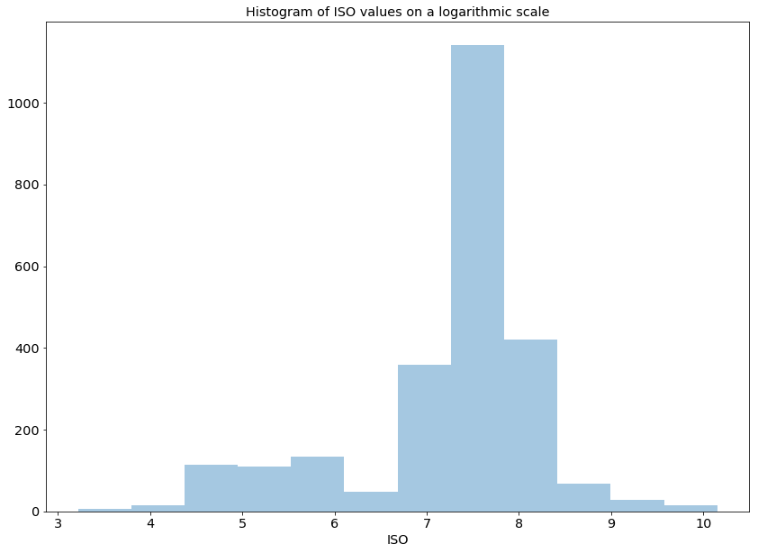
Cool, it looks like there’s heavy usage in the mid “7”s but what does that translate to in actual ISO?
# https://jakevdp.github.io/PythonDataScienceHandbook/04.10-customizing-ticks.html
ax = plt.axes()

# Setup custom lambda to return actual ISO value for input. get_iso(7) would return 1096.
get_iso = lambda x,_: int(np.exp(x))

# Apply our custom function to the x axis
ax.xaxis.set_major_formatter(plt.FuncFormatter(get_iso))

ax.set_title('Histogram of ISO values')

# Graph as above
sns.distplot(digi_photos_df.ISO.dropna().apply(np.log), kde=False, rug=False, bins=12)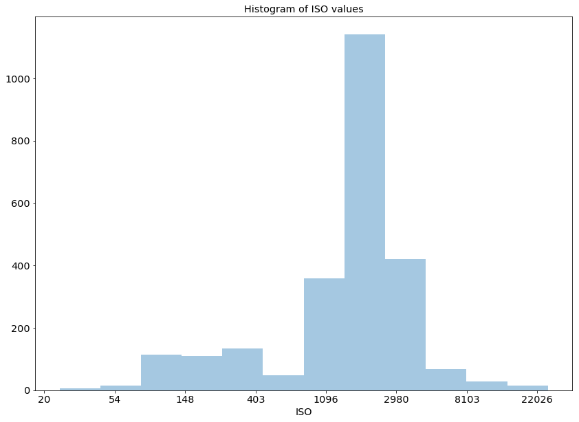
Voila!
We can easily see that the most frequently used ISO looks to be ~1600 which we can confirm with the chart below.
digi_photos_df.ISO.value_counts().head(5)1600.0 1052
3200.0 384
800.0 241
100.0 108
400.0 108
Name: ISO, dtype: int64Let’s see if picture taking is more frequent during particular months or years
# Convert the 'DateTimeOriginal' format to datetimeformat
datetimes = pd.to_datetime(digi_photos_df.DateTimeOriginal, format='%Y:%m:%d %H:%M:%S', errors='coerce').dropna()
# Extract month and year to create a new dataframe
datetime_df = pd.DataFrame(data={'month':datetimes.dt.month, 'year':datetimes.dt.year})
# Tally the counts of pictures taken each month/year using gropuby
datetime_df = datetime_df.groupby(['month','year']).size().reset_index(name='counts')
# Create a pivot table to plot
datetime_df = datetime_df.pivot('month','year','counts').fillna(0)
# Display
datetime_df| year | 2004 | 2005 | 2006 | 2007 | 2008 | 2009 | 2010 | 2011 | 2012 | 2013 | 2014 | 2015 | 2016 | 2017 | 2018 |
|---|---|---|---|---|---|---|---|---|---|---|---|---|---|---|---|
| month | |||||||||||||||
| 1 | 0.0 | 0.0 | 0.0 | 0.0 | 1.0 | 4.0 | 0.0 | 0.0 | 0.0 | 0.0 | 0.0 | 12.0 | 2.0 | 0.0 | 137.0 |
| 2 | 0.0 | 0.0 | 0.0 | 0.0 | 0.0 | 4.0 | 2.0 | 0.0 | 0.0 | 0.0 | 0.0 | 0.0 | 0.0 | 0.0 | 71.0 |
| 3 | 0.0 | 0.0 | 0.0 | 2.0 | 0.0 | 7.0 | 0.0 | 3.0 | 5.0 | 0.0 | 0.0 | 0.0 | 0.0 | 0.0 | 44.0 |
| 4 | 0.0 | 0.0 | 0.0 | 5.0 | 0.0 | 64.0 | 0.0 | 1.0 | 1.0 | 2.0 | 0.0 | 39.0 | 0.0 | 0.0 | 24.0 |
| 5 | 0.0 | 2.0 | 0.0 | 27.0 | 8.0 | 1.0 | 1.0 | 6.0 | 1.0 | 0.0 | 0.0 | 12.0 | 0.0 | 0.0 | 2.0 |
| 6 | 0.0 | 5.0 | 10.0 | 32.0 | 40.0 | 19.0 | 0.0 | 22.0 | 15.0 | 0.0 | 0.0 | 0.0 | 0.0 | 0.0 | 0.0 |
| 7 | 0.0 | 0.0 | 29.0 | 35.0 | 74.0 | 52.0 | 0.0 | 6.0 | 9.0 | 0.0 | 0.0 | 12.0 | 0.0 | 0.0 | 0.0 |
| 8 | 0.0 | 0.0 | 20.0 | 21.0 | 51.0 | 19.0 | 0.0 | 1.0 | 0.0 | 0.0 | 3.0 | 0.0 | 1.0 | 0.0 | 0.0 |
| 9 | 0.0 | 0.0 | 47.0 | 57.0 | 53.0 | 19.0 | 24.0 | 1.0 | 14.0 | 0.0 | 2.0 | 1.0 | 33.0 | 0.0 | 0.0 |
| 10 | 0.0 | 2.0 | 66.0 | 88.0 | 121.0 | 11.0 | 108.0 | 16.0 | 13.0 | 0.0 | 269.0 | 7.0 | 4.0 | 2.0 | 0.0 |
| 11 | 1.0 | 0.0 | 58.0 | 52.0 | 60.0 | 0.0 | 38.0 | 2.0 | 62.0 | 0.0 | 90.0 | 20.0 | 0.0 | 0.0 | 0.0 |
| 12 | 1.0 | 31.0 | 7.0 | 35.0 | 9.0 | 3.0 | 11.0 | 0.0 | 0.0 | 0.0 | 27.0 | 2.0 | 0.0 | 43.0 | 0.0 |
We now have a nice chart of shots taken over the years. Let’s create a heat map to make it easier to visualize.
ax = sns.heatmap(datetime_df)
ax.set_title('Frequency of Picture Taking over Time\n(Darker is less, brighter is more)')
Text(0.5,1,'Frequency of Picture Taking over Time\n(Darker is less, brighter is more)')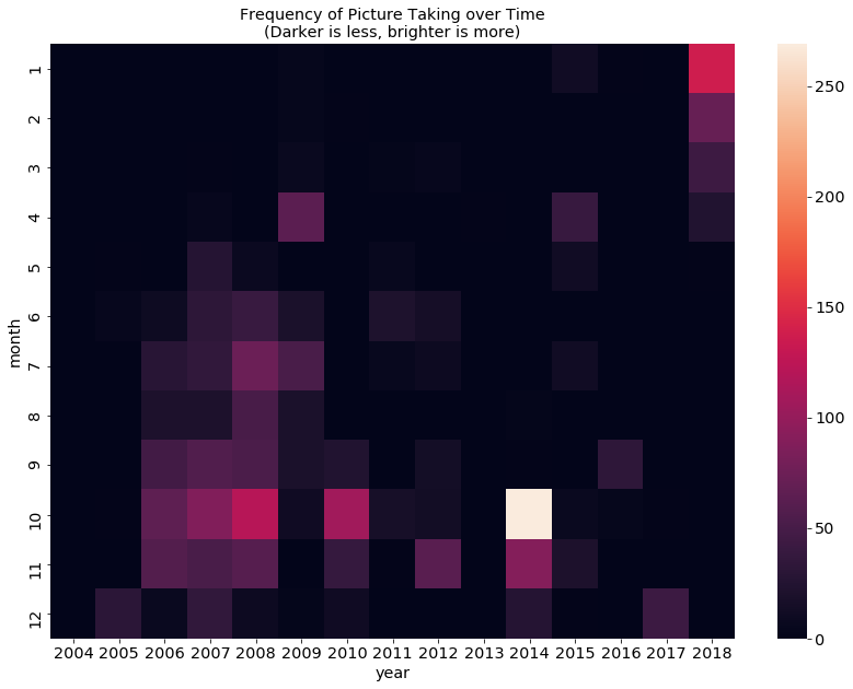
As one would figure there is much less activity during the winter months which isn’t too surprising since june1777 is an outdoor photographer. October seems to be his active month with a particularly busy one in 2014. Wonder what happened then. We also see a flare-up of activity in January of 2018. Maybe a dose of inspiration.
Let’s analyze what hours of the day he typically shoots
# Extract month and year to create a new dataframe
datetime_df = pd.DataFrame(data={'hour':datetimes.dt.hour, 'month':datetimes.dt.month})
# Tally the counts of pictures taken each month/year using gropuby
datetime_df = datetime_df.groupby(['hour','month']).size().reset_index(name='counts')
# Create a pivot table to plot
datetime_df = datetime_df.pivot('hour','month','counts').fillna(0)
# Display
datetime_df| month | 1 | 2 | 3 | 4 | 5 | 6 | 7 | 8 | 9 | 10 | 11 | 12 |
|---|---|---|---|---|---|---|---|---|---|---|---|---|
| hour | ||||||||||||
| 0 | 0.0 | 1.0 | 0.0 | 0.0 | 0.0 | 0.0 | 4.0 | 0.0 | 1.0 | 5.0 | 0.0 | 0.0 |
| 7 | 0.0 | 0.0 | 0.0 | 0.0 | 1.0 | 0.0 | 0.0 | 0.0 | 0.0 | 0.0 | 0.0 | 0.0 |
| 8 | 0.0 | 0.0 | 0.0 | 0.0 | 0.0 | 0.0 | 0.0 | 0.0 | 0.0 | 0.0 | 1.0 | 0.0 |
| 9 | 0.0 | 0.0 | 0.0 | 0.0 | 0.0 | 0.0 | 0.0 | 0.0 | 0.0 | 0.0 | 0.0 | 2.0 |
| 10 | 0.0 | 0.0 | 0.0 | 0.0 | 0.0 | 0.0 | 0.0 | 1.0 | 0.0 | 1.0 | 0.0 | 0.0 |
| 11 | 0.0 | 0.0 | 0.0 | 0.0 | 2.0 | 0.0 | 1.0 | 0.0 | 4.0 | 6.0 | 1.0 | 0.0 |
| 12 | 2.0 | 0.0 | 0.0 | 4.0 | 0.0 | 1.0 | 3.0 | 2.0 | 2.0 | 26.0 | 12.0 | 1.0 |
| 13 | 0.0 | 0.0 | 2.0 | 0.0 | 1.0 | 1.0 | 2.0 | 4.0 | 0.0 | 15.0 | 13.0 | 0.0 |
| 14 | 2.0 | 0.0 | 3.0 | 0.0 | 1.0 | 0.0 | 1.0 | 2.0 | 18.0 | 5.0 | 8.0 | 2.0 |
| 15 | 0.0 | 1.0 | 4.0 | 2.0 | 0.0 | 1.0 | 5.0 | 6.0 | 2.0 | 5.0 | 5.0 | 1.0 |
| 16 | 2.0 | 1.0 | 2.0 | 5.0 | 1.0 | 3.0 | 5.0 | 5.0 | 5.0 | 11.0 | 7.0 | 8.0 |
| 17 | 0.0 | 5.0 | 0.0 | 0.0 | 1.0 | 0.0 | 8.0 | 2.0 | 6.0 | 18.0 | 15.0 | 12.0 |
| 18 | 1.0 | 7.0 | 0.0 | 2.0 | 2.0 | 3.0 | 2.0 | 5.0 | 13.0 | 33.0 | 20.0 | 7.0 |
| 19 | 22.0 | 5.0 | 11.0 | 20.0 | 7.0 | 22.0 | 29.0 | 42.0 | 53.0 | 73.0 | 55.0 | 25.0 |
| 20 | 87.0 | 17.0 | 17.0 | 43.0 | 35.0 | 53.0 | 69.0 | 24.0 | 63.0 | 179.0 | 82.0 | 51.0 |
| 21 | 25.0 | 25.0 | 15.0 | 27.0 | 6.0 | 32.0 | 48.0 | 14.0 | 58.0 | 212.0 | 65.0 | 33.0 |
| 22 | 14.0 | 7.0 | 6.0 | 28.0 | 1.0 | 22.0 | 37.0 | 9.0 | 22.0 | 97.0 | 96.0 | 22.0 |
| 23 | 1.0 | 8.0 | 1.0 | 5.0 | 2.0 | 5.0 | 3.0 | 0.0 | 4.0 | 21.0 | 3.0 | 5.0 |
Frequency of pictures taken by hour and month. Notice the hours of 1-6 AM are missing since he was probably sleeping then. Let’s fill this in so we get a comprehensive view.
early_morning_df = pd.DataFrame([ { i:0 for i in range(1,13) } for i in range(1,7) ], index=range(1,7))
datetime_df = datetime_df.append(early_morning_df).sort_index()
datetime_df| month | 1 | 2 | 3 | 4 | 5 | 6 | 7 | 8 | 9 | 10 | 11 | 12 |
|---|---|---|---|---|---|---|---|---|---|---|---|---|
| 0 | 0.0 | 1.0 | 0.0 | 0.0 | 0.0 | 0.0 | 4.0 | 0.0 | 1.0 | 5.0 | 0.0 | 0.0 |
| 1 | 0.0 | 0.0 | 0.0 | 0.0 | 0.0 | 0.0 | 0.0 | 0.0 | 0.0 | 0.0 | 0.0 | 0.0 |
| 2 | 0.0 | 0.0 | 0.0 | 0.0 | 0.0 | 0.0 | 0.0 | 0.0 | 0.0 | 0.0 | 0.0 | 0.0 |
| 3 | 0.0 | 0.0 | 0.0 | 0.0 | 0.0 | 0.0 | 0.0 | 0.0 | 0.0 | 0.0 | 0.0 | 0.0 |
| 4 | 0.0 | 0.0 | 0.0 | 0.0 | 0.0 | 0.0 | 0.0 | 0.0 | 0.0 | 0.0 | 0.0 | 0.0 |
| 5 | 0.0 | 0.0 | 0.0 | 0.0 | 0.0 | 0.0 | 0.0 | 0.0 | 0.0 | 0.0 | 0.0 | 0.0 |
| 6 | 0.0 | 0.0 | 0.0 | 0.0 | 0.0 | 0.0 | 0.0 | 0.0 | 0.0 | 0.0 | 0.0 | 0.0 |
| 7 | 0.0 | 0.0 | 0.0 | 0.0 | 1.0 | 0.0 | 0.0 | 0.0 | 0.0 | 0.0 | 0.0 | 0.0 |
| 8 | 0.0 | 0.0 | 0.0 | 0.0 | 0.0 | 0.0 | 0.0 | 0.0 | 0.0 | 0.0 | 1.0 | 0.0 |
| 9 | 0.0 | 0.0 | 0.0 | 0.0 | 0.0 | 0.0 | 0.0 | 0.0 | 0.0 | 0.0 | 0.0 | 2.0 |
| 10 | 0.0 | 0.0 | 0.0 | 0.0 | 0.0 | 0.0 | 0.0 | 1.0 | 0.0 | 1.0 | 0.0 | 0.0 |
| 11 | 0.0 | 0.0 | 0.0 | 0.0 | 2.0 | 0.0 | 1.0 | 0.0 | 4.0 | 6.0 | 1.0 | 0.0 |
| 12 | 2.0 | 0.0 | 0.0 | 4.0 | 0.0 | 1.0 | 3.0 | 2.0 | 2.0 | 26.0 | 12.0 | 1.0 |
| 13 | 0.0 | 0.0 | 2.0 | 0.0 | 1.0 | 1.0 | 2.0 | 4.0 | 0.0 | 15.0 | 13.0 | 0.0 |
| 14 | 2.0 | 0.0 | 3.0 | 0.0 | 1.0 | 0.0 | 1.0 | 2.0 | 18.0 | 5.0 | 8.0 | 2.0 |
| 15 | 0.0 | 1.0 | 4.0 | 2.0 | 0.0 | 1.0 | 5.0 | 6.0 | 2.0 | 5.0 | 5.0 | 1.0 |
| 16 | 2.0 | 1.0 | 2.0 | 5.0 | 1.0 | 3.0 | 5.0 | 5.0 | 5.0 | 11.0 | 7.0 | 8.0 |
| 17 | 0.0 | 5.0 | 0.0 | 0.0 | 1.0 | 0.0 | 8.0 | 2.0 | 6.0 | 18.0 | 15.0 | 12.0 |
| 18 | 1.0 | 7.0 | 0.0 | 2.0 | 2.0 | 3.0 | 2.0 | 5.0 | 13.0 | 33.0 | 20.0 | 7.0 |
| 19 | 22.0 | 5.0 | 11.0 | 20.0 | 7.0 | 22.0 | 29.0 | 42.0 | 53.0 | 73.0 | 55.0 | 25.0 |
| 20 | 87.0 | 17.0 | 17.0 | 43.0 | 35.0 | 53.0 | 69.0 | 24.0 | 63.0 | 179.0 | 82.0 | 51.0 |
| 21 | 25.0 | 25.0 | 15.0 | 27.0 | 6.0 | 32.0 | 48.0 | 14.0 | 58.0 | 212.0 | 65.0 | 33.0 |
| 22 | 14.0 | 7.0 | 6.0 | 28.0 | 1.0 | 22.0 | 37.0 | 9.0 | 22.0 | 97.0 | 96.0 | 22.0 |
| 23 | 1.0 | 8.0 | 1.0 | 5.0 | 2.0 | 5.0 | 3.0 | 0.0 | 4.0 | 21.0 | 3.0 | 5.0 |
Now let’s plot ..
ax = sns.heatmap(datetime_df)
ax.set_title('Frequency of Picture Taking by Hour of day\n(Darker is less, brighter is more)')
Text(0.5,1,'Frequency of Picture Taking by Hour of day\n(Darker is less, brighter is more)')
And we see lots of evening shooting. Again, not surprising since much of his work takes place at night especially between 8 and 9PM. I suspect the flareup we see in October is probably the 2014 jump we saw in the previous graph.
Let’s try something different. How about we try to map the use of camera models over time.
datetimes = pd.to_datetime(digi_photos_df.DateTimeOriginal, format='%Y:%m:%d %H:%M:%S', errors='ignore').dropna()
# Let's make a new dataframe with just month, year, and Model
models_df = pd.DataFrame(data={'year':datetimes.dt.year, 'model':digi_photos_df.Model})
models_df = models_df.groupby(['year','model']).size().reset_index(name='counts')
First let’s see if there are any infrequently used models we can drop.
digi_photos_df.Model.value_counts()Canon EOS 5D 1495
ILCE-7 550
ILCE-7M2 215
NEX-3 120
CONTAX N DIGITAL 73
210 9
QSS-29_31 5
201 4
260 2
225 1
236 1
252 1
278 1
256 1
Canon EOS 5D, nds3 1
Name: Model, dtype: int64I’m not sure what those models that have only numbers in them are but prob safe to drop them.
# Create dataframe with the top 5 most popular models
popular_models = digi_photos_df.Model.value_counts().head(5).index.tolist()
popular_models
['Canon EOS 5D', 'ILCE-7', 'ILCE-7M2', 'NEX-3', 'CONTAX N DIGITAL']Let’s create a pivot table of camera model for columns and years for rows
models_df = models_df[models_df['model'].isin(popular_models)]
models_df = models_df.pivot('year','model','counts').fillna(0)
models_df| model | CONTAX N DIGITAL | Canon EOS 5D | ILCE-7 | ILCE-7M2 | NEX-3 |
|---|---|---|---|---|---|
| year | |||||
| 2004.0 | 2.0 | 0.0 | 0.0 | 0.0 | 0.0 |
| 2005.0 | 9.0 | 31.0 | 0.0 | 0.0 | 0.0 |
| 2006.0 | 0.0 | 237.0 | 0.0 | 0.0 | 0.0 |
| 2007.0 | 0.0 | 353.0 | 0.0 | 0.0 | 0.0 |
| 2008.0 | 0.0 | 417.0 | 0.0 | 0.0 | 0.0 |
| 2009.0 | 0.0 | 202.0 | 0.0 | 0.0 | 0.0 |
| 2010.0 | 43.0 | 21.0 | 0.0 | 0.0 | 120.0 |
| 2011.0 | 19.0 | 24.0 | 0.0 | 0.0 | 0.0 |
| 2012.0 | 0.0 | 115.0 | 0.0 | 0.0 | 0.0 |
| 2013.0 | 0.0 | 2.0 | 0.0 | 0.0 | 0.0 |
| 2014.0 | 0.0 | 4.0 | 386.0 | 0.0 | 0.0 |
| 2015.0 | 0.0 | 12.0 | 93.0 | 0.0 | 0.0 |
| 2016.0 | 0.0 | 12.0 | 28.0 | 0.0 | 0.0 |
| 2017.0 | 0.0 | 2.0 | 43.0 | 0.0 | 0.0 |
| 2018.0 | 0.0 | 63.0 | 0.0 | 215.0 | 0.0 |
**Far and away the Canon 5D saw the heaviest use with the Sonys (ILCE-*) catching up in recent times. I have a soft spot for the Canon 5d MK1, it being my first full frame. Boy have times changed since 2005**
Finally let’s plot the usage of models over time
ax = sns.lineplot(data=models_df)
